Web Design
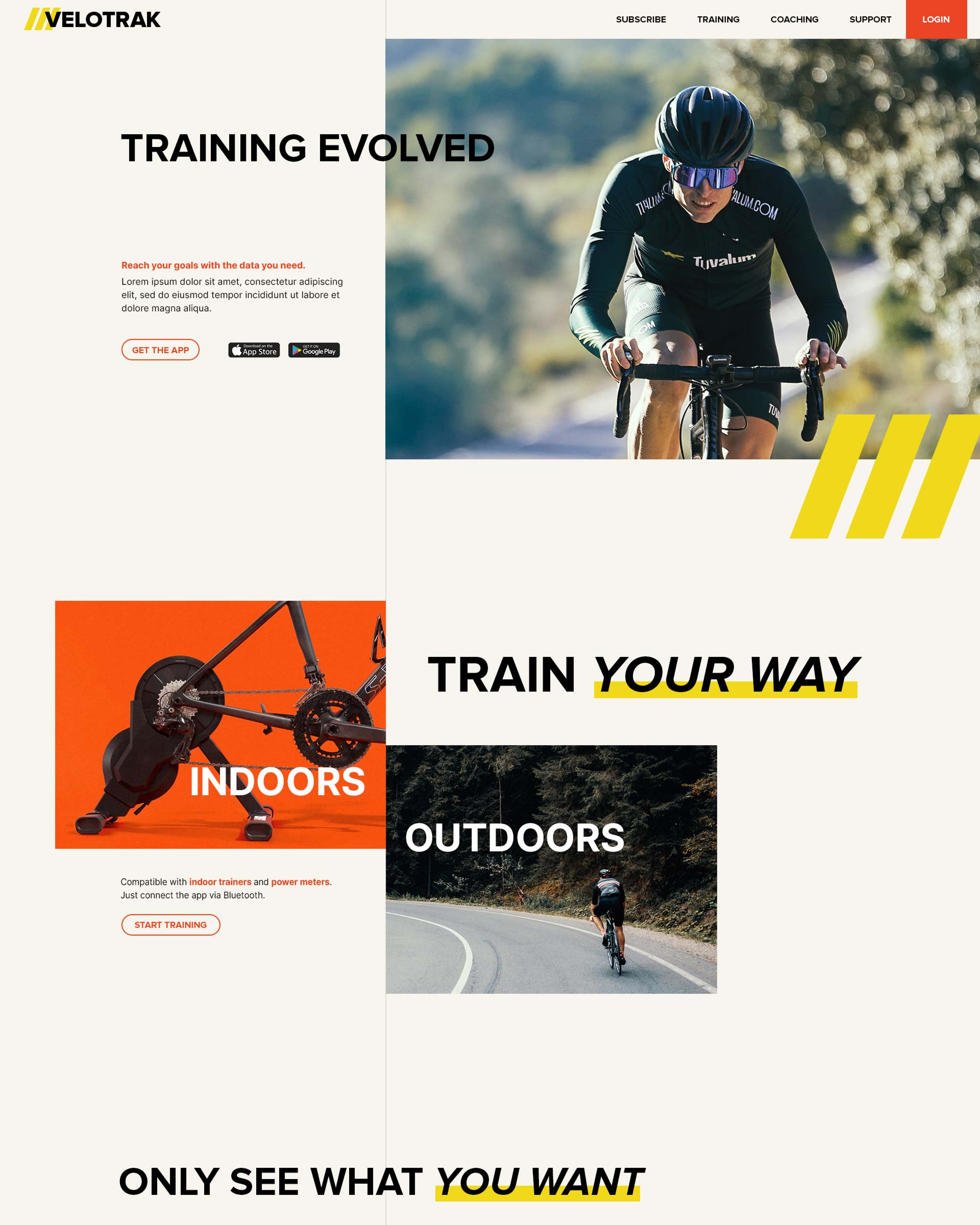
"VELOTRAK"
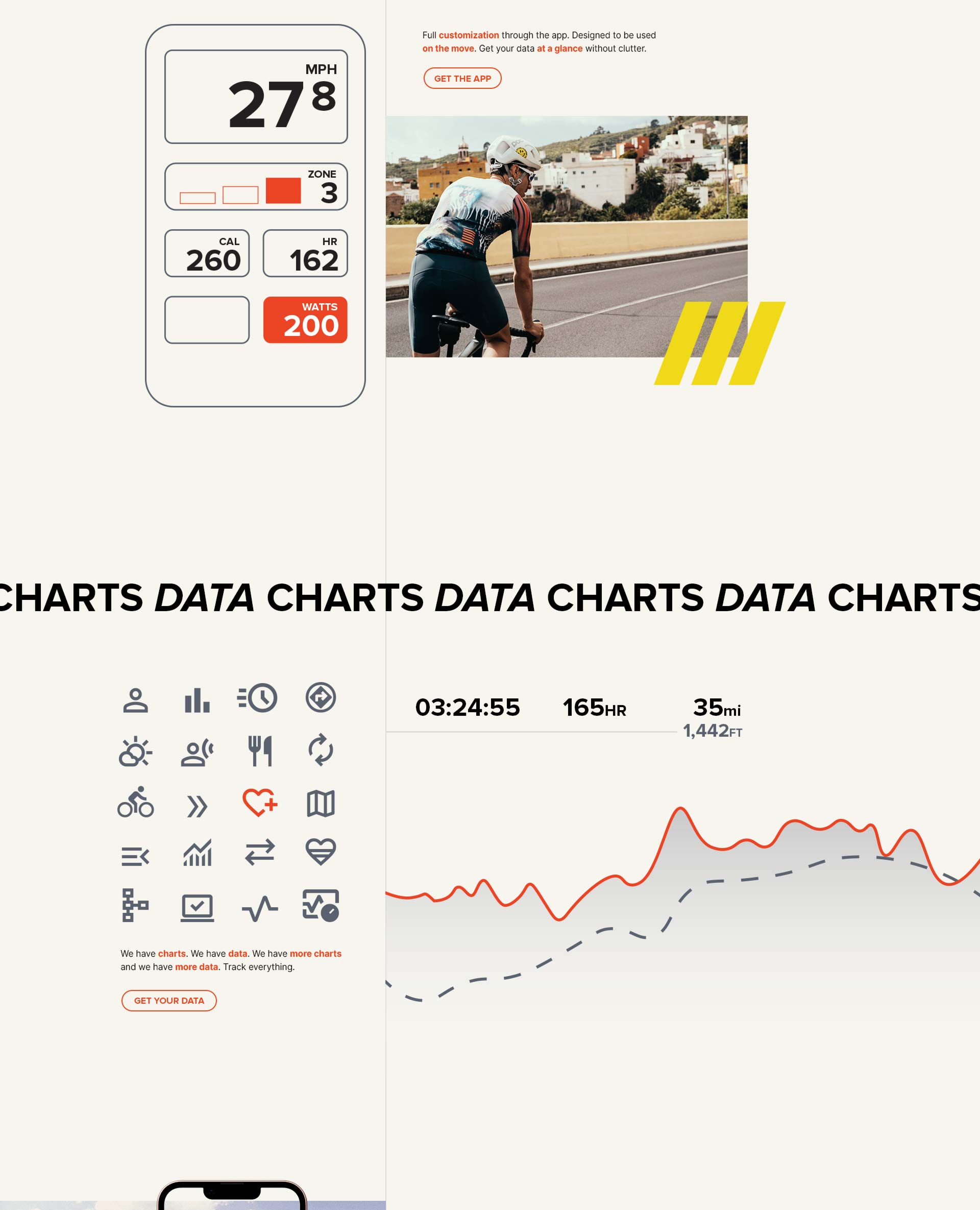
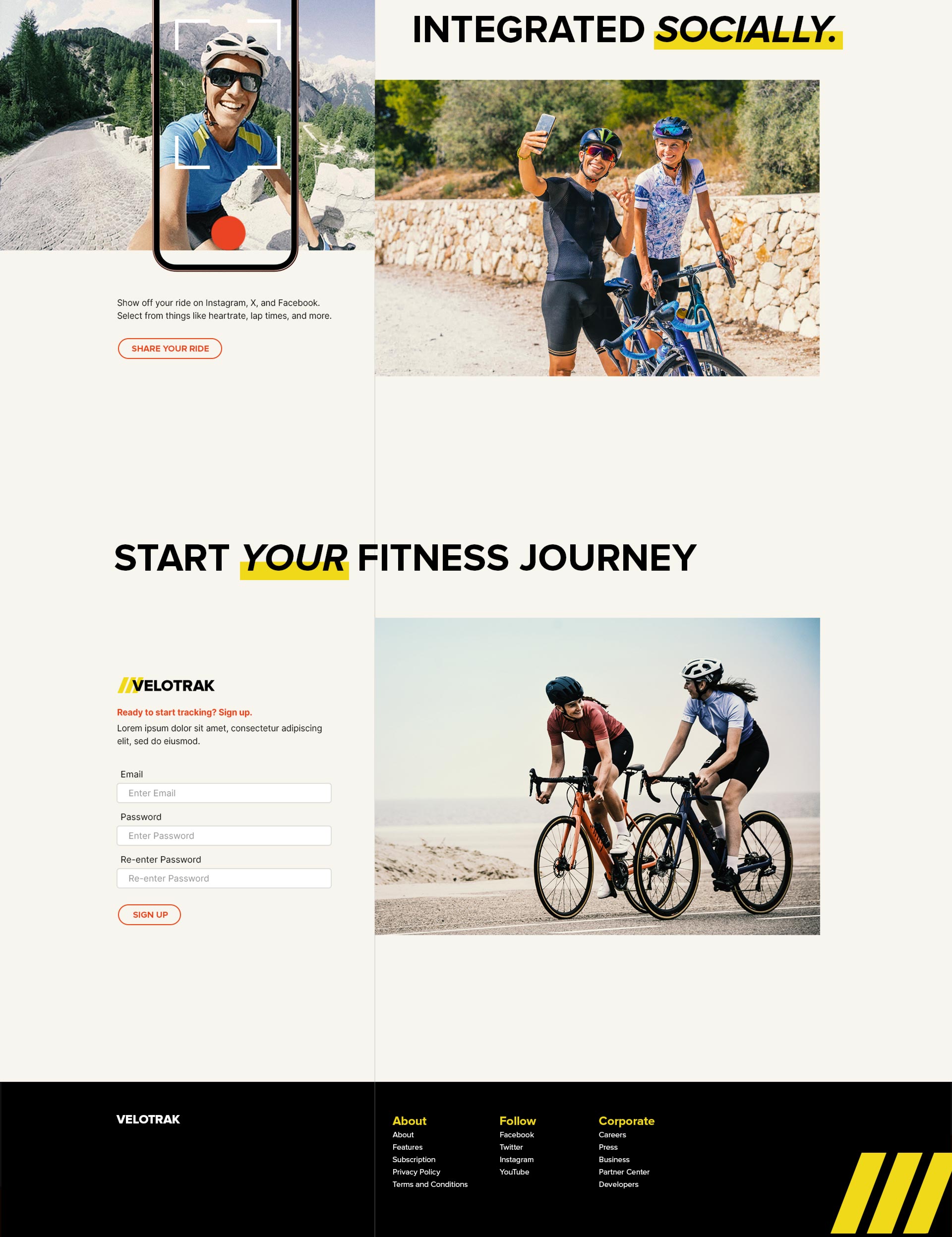
The target persona for this website is a road cycling enthusiast that likes to nerd out to data. The visual style of road cycling tends to be upscale, modern, clean, with a European slant. I love the Kodak color scheme and used that as a base for color choice, applying a Kodak LUT to all the photos for harmonization. I wanted to go with an asymmetrical layout that splits the page into 2 sections, the vertical line travels down the entire page as a visual anchor and the text draws attention when it breaks the hard boundaries created by it. As a home page the content was made to be skimmer friendly with a call to action for every section.


